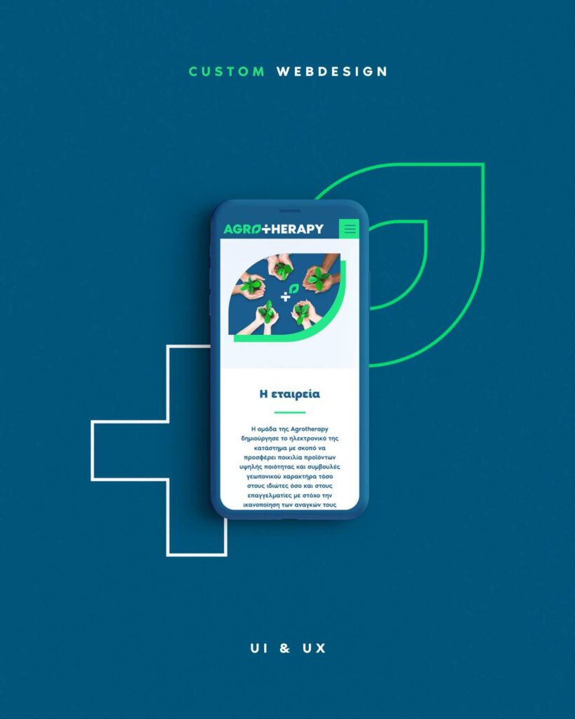
Logo, Brand Identity, Website UI/UX Design, and Social Media Marketing for the agricultural e-commerce company Agrotherapy.
The name Agrotherapy derives from the Greek words “agros” (field) and “therapeia” (therapy), expressing the essence of the brand: the connection between the land, care, growth, and natural rejuvenation.
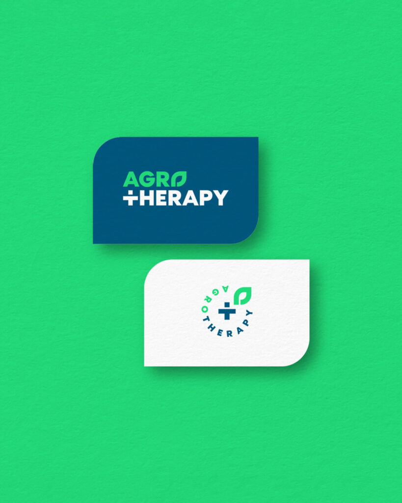
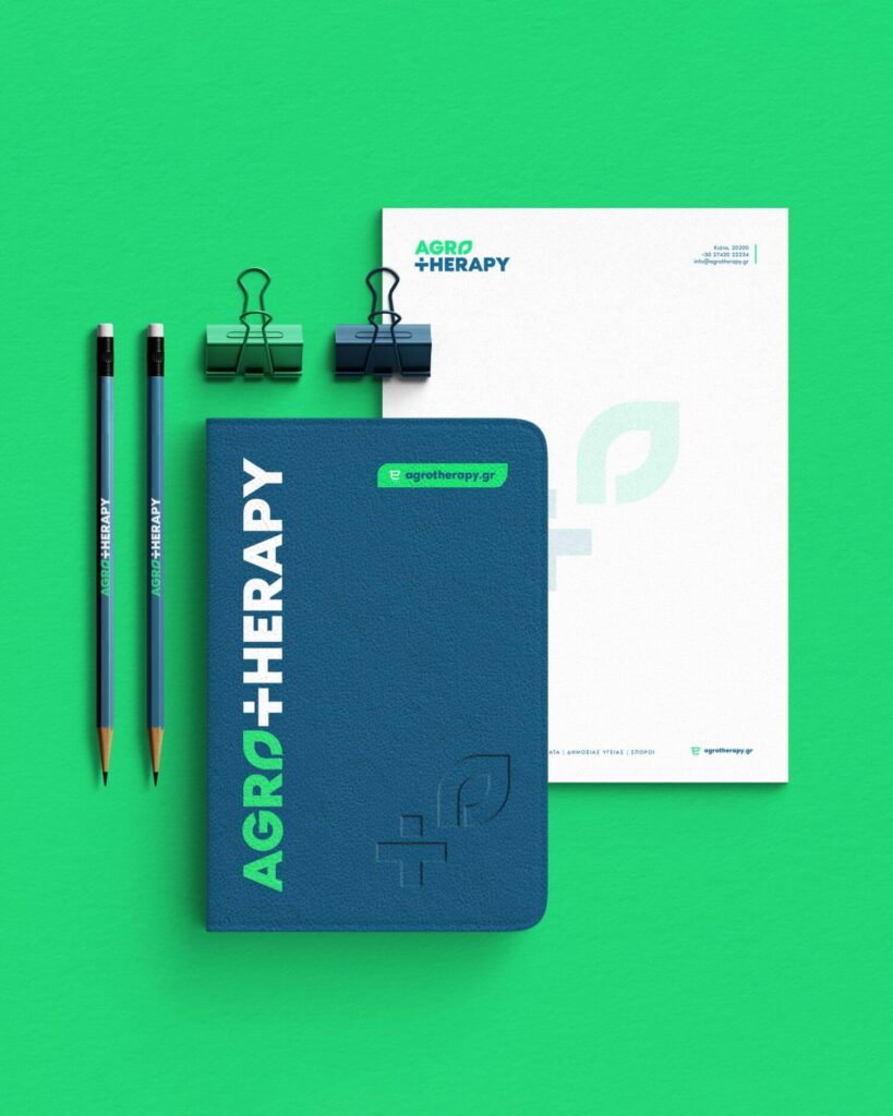
The logo reflects this philosophy through the symbol of the leaf, representing the vitality and fertility of nature, and the cross, symbolizing the healing aspect of agriculture and humanity’s care for the environment.
The color palette of deep blue and vibrant green reinforces the brand’s dual identity. Deep blue conveys reliability, stability, and the company’s technological dimension, while vibrant green expresses vitality, nature, and continuous renewal – core elements of the agricultural cycle.
Through a combination of contemporary UI/UX design and targeted social media presence, Agrotherapy’s branding presents a fresh, grounded, and trustworthy identity that bridges the tradition of the land with the power of technology.


